I worked on the project from begining to end. I was in charge of the research, the design explorations, the elaboration of the design system and prototypes but also the facilitation of communication within the team. I worked with 2 other students, Léa Veron and Mariya Panshak. Léa and I worked more on UX and research while Mariya got more involved in the graphical part.
First of all, what's an “assistante maternelle” in short “assmat”
(childminder). It's an employee of private or public establishment
or an individual, working in the care of children for all or part of
the day, at their home (most of the time).
In France, 30% of parents ideally want a childminder, but it can be
really hard for them to find one because demand is extremely high
compared to the offer.
The Pays de la Loire region has therefore decided to make a call for
tender to improve accessibility for the parents on the region's
childminder website and the matching between parents and
childminders. It also allows each childminder to present themselves
on professional criterion. And finally, to portray an image that
highlights the region uniqueness.
It is in this context that we worked on a real tender but we didn't
actually propose our solution.
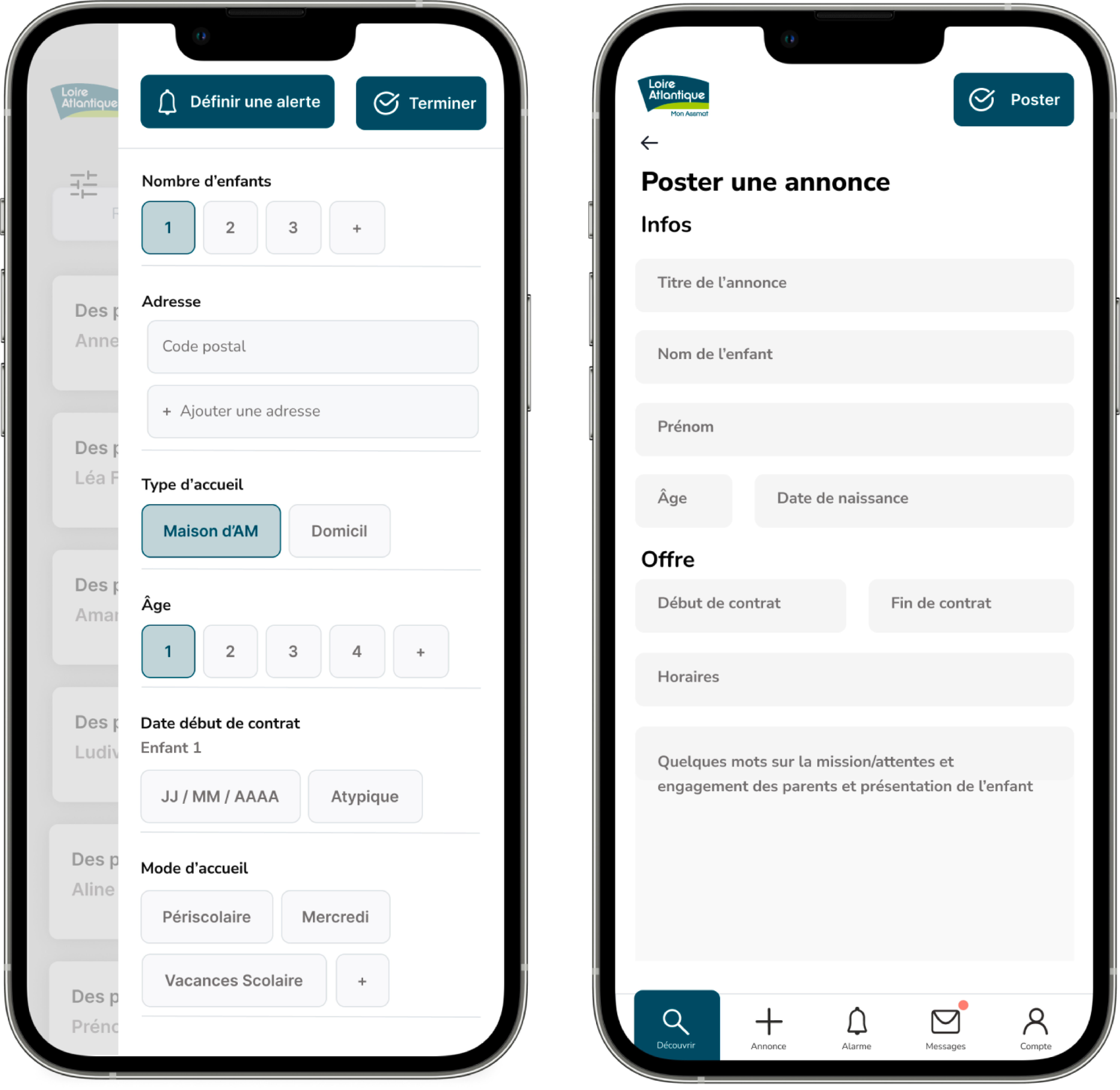
We focused on hyper-reactivity and rapidity by creating features such as:
Our goal was to help childminders and parents establish contact and make the research of a childminder fast and even enjoyable. In order to achieve this, the plan was to create a delightful, visual, simple solution.
First and foremost, we started by understanding how childminders work. Professionals require regional accreditation to be included in the region's official childminder list. This approval guarantees reliability and safety in terms of their ability.
We sent a survey to a person working in an early childhood association in the Vendée region in order to look closer at how the research happens. After that we created a 10 questions Google Form and shared it in some Facebook groups and online forums dedicated to finding an childminder in order to try to understand the parents' problems. We gathered 62 answers which permitted us to highlight important fears and needs. Here the most important ones:
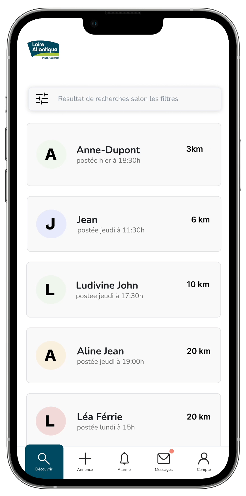
This helped us highlight user cases and identify the main user pain points to move forward in the project. For example this gave us insights in terms of search filters.
Many different persons are looking for a child minder but with our previous research we were able to establish recurrent profiles, goals and frustrations.
We conducted a competitive analysis to discover what is the current state of childminder websites, regional websites, key points to work on and features that we found interesting to propose and the best solution at the end.
This helped us to establish some guiding principles and allowed us to get inspired for the graphical charter.
After that, we chose colours, typography, icons in order to be accessible and enjoyable, worked on the logo and pictogrammes. And then we made a design system on Figma with styles and components.
At first, we made rapid site map and sketches and then we created wireframes.
Two parents can connect at the same time allowing them to reply
faster to offers which increases answer rapidity, and to share
tasks.
The home page offers articles about childminder work.
Two ways of actions each focused on hyper - reactivity:
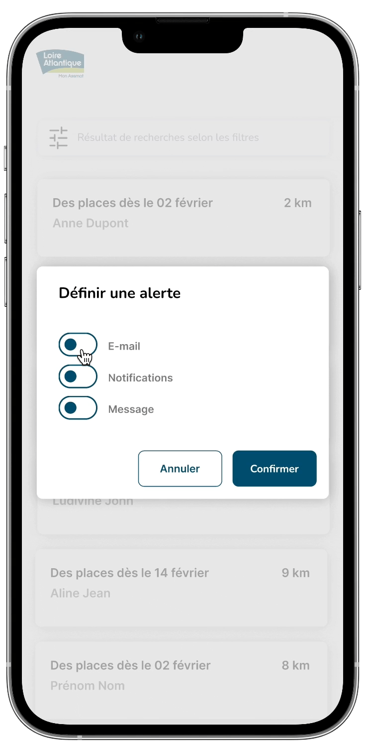
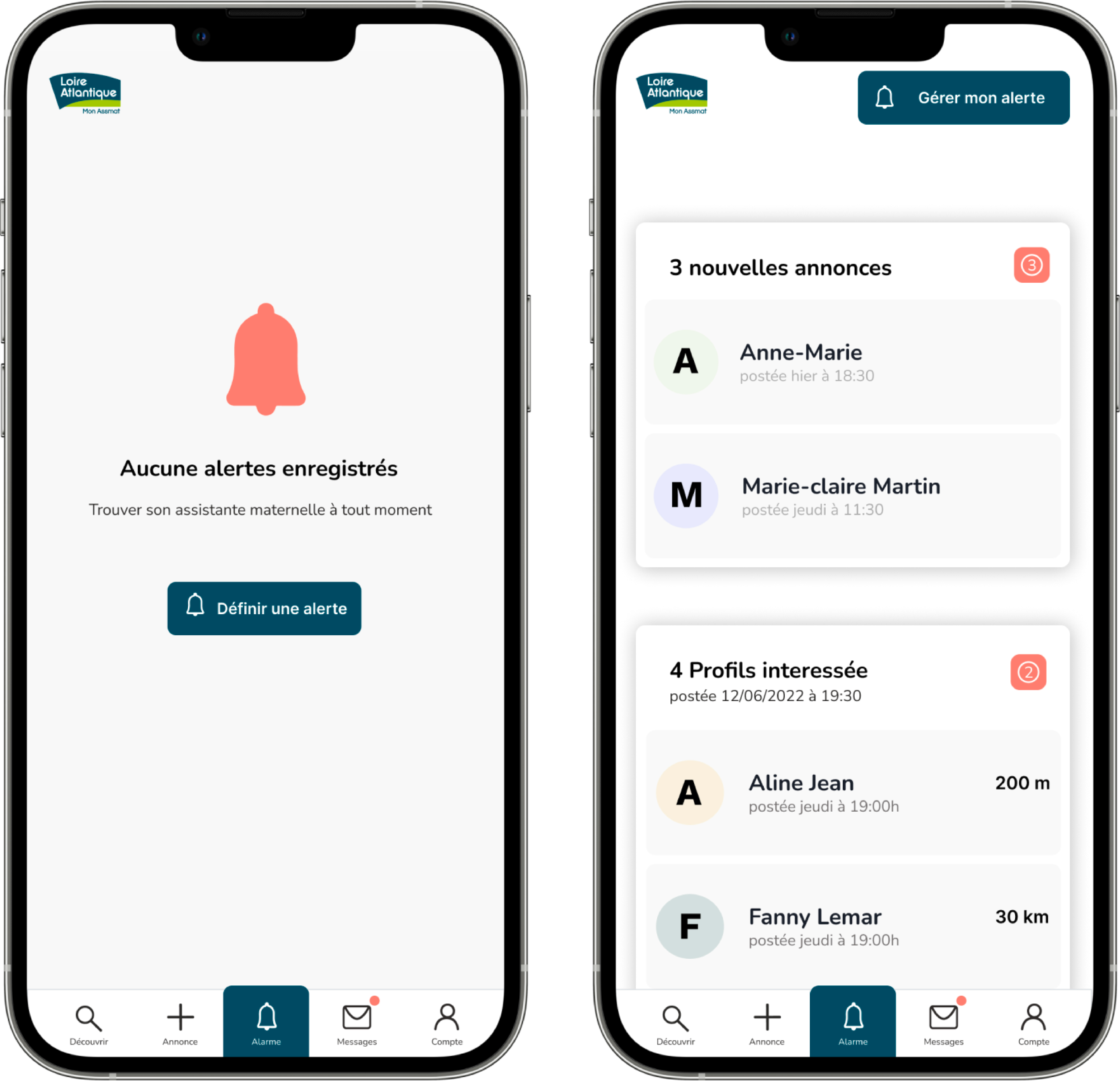
Users are able to manage their notifications and saved alerts.
It would be interesting to push the project further by conducting user tests.
Thanks to our instructor Xavier Drouaud.
Léa Veron, student
Mariya Panshak, student
France Hémain, student