Card image cap
Research, UX, UI, Proactivity

From parkour to prosperity: Revitalizing TDN's website with proactive research and design

EDNA, Nantes, France

November 2021 - February 2022

My role

The project was realized with Léa Veron and Galadriel Buchou. All three of us participated equally on the project.

The problem

TDN, “Traceur de Nantes” is a French club that proposes Freerunning courses and workshops to beginners as well as to confirmed practitioners. The objective of the club is to promote and spread the practice of this urban sport. As the club develops, the volume of its activities grows, the courses multiply and the audience is diversifying. So, we took this opportunity to work on a new visual identity and a redesign of the site to cope with those new challenges.

The solution

We worked on improving accessibility and registration, thus gaining in efficiency for the user. We worked on creating dynamism for youth while inspiring trust and safety for parents.

The process

  • We set off a sociological and anthropological research to understand Parkour's community and association in order to create the new website in accordance with its values, history, objectives and members.
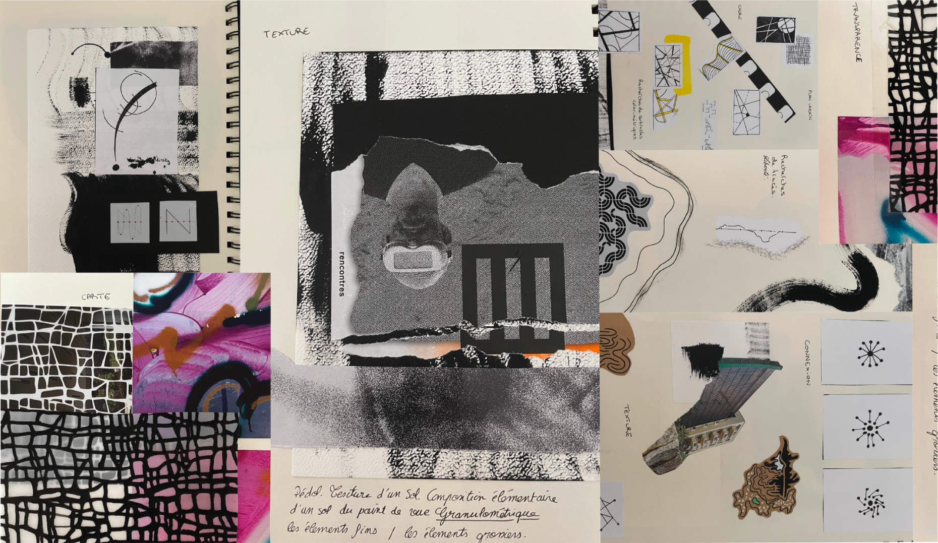
  • We experimented on various media and with different techniques to chose visual working axes to tend to a visual identity corresponding with the discipline's and association's values.
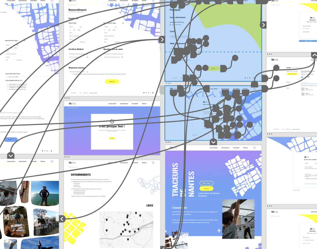
  • We followed a methodical approach, user scenarios, site map, wireframe to create a functional prototype of the new website.
  • We tested the website's prototype with an eye tracking system to make a test analysis in order to improve the interface.
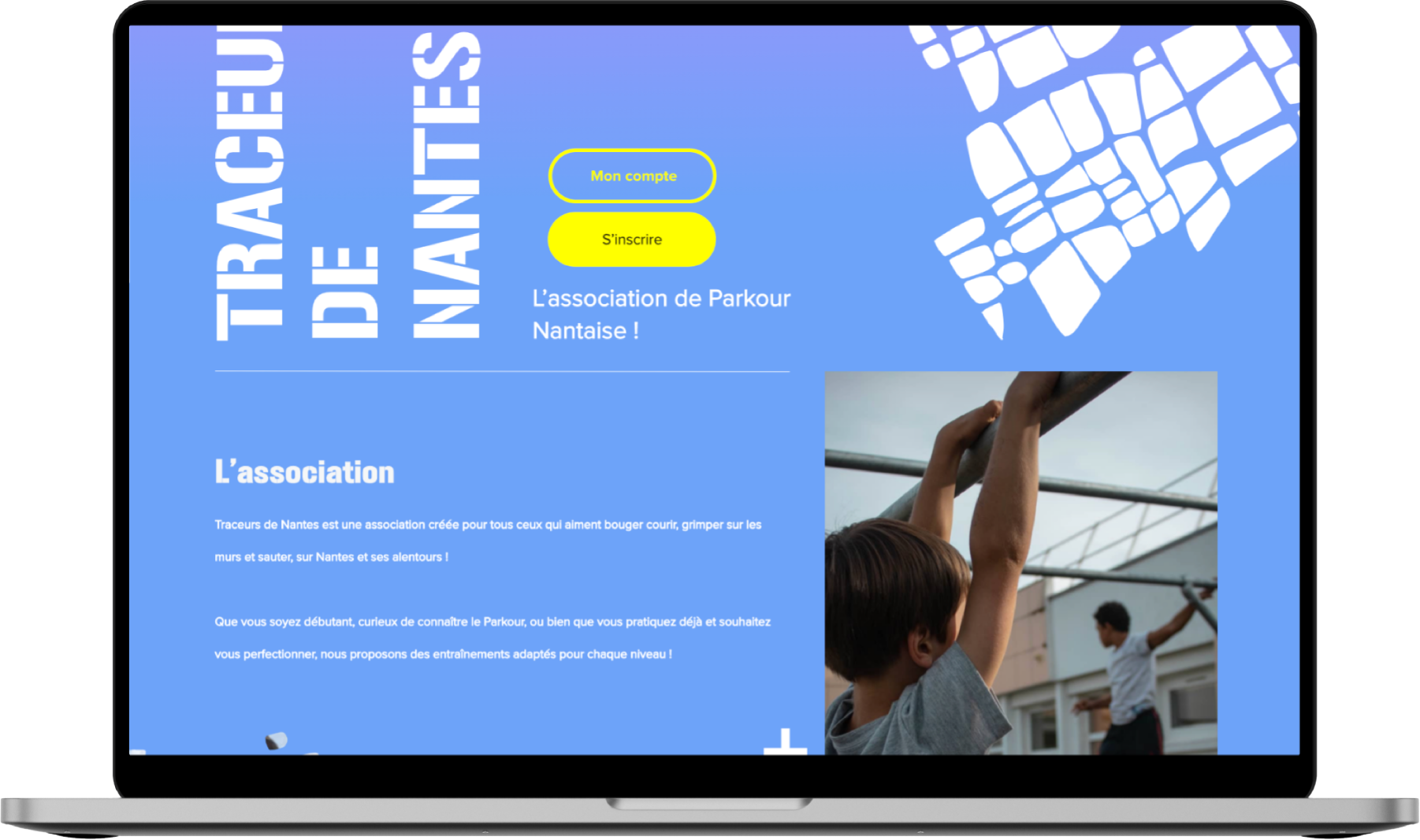
Mockup of parkour.

Understanding Parkour

Research

We set up several methods of approaching the parkour domain. On the one hand we conducted research about parkour's history, social, legal and existential ecosystem. On the other hand we had exchanges with traceurs which allowed us to better understand the art, its own codes and values.

Parkour's Fact

  • Where and why?
    The course was born in the Parisian suburbs, more precisely in Evry, in the 1980s. It is the investment of public spaces, the reflection of the marginalization of the suburban populations. Parkour enthusiasts, through their practice, reclaim the entire urban space.
  • Who?
    David Belle is acknowledged as the inventor of parkour and founded an original and official group of parkour practitioners called Yamakasi. One day when David Belle was on a film set, he showed his 'Speed Air Man' video to Hubert Koundé, who suggested to change the "c" of "parcours" to a "k" because it was more dynamic and stronger, and to remove the silent "s" for the same reason. Belle liked the idea and officially changed the name of his discipline to "parkour”.
  • What?
  • Parkour is an athletic training discipline, it promotes not only the discipline of the body, the value of training, the importance of a healthy lifestyle but also respect for the instructor and others.

Analysis of the current / quantitative data

  • If we estimate the total French community at about 2,000 - 2,500 practitioners, parkour although constantly increasing, remains a niche sport.
  • Parkour is still practiced today by an essentially male public, since 85% of French practitioners are men according to the French Parkour Federation in 2018.
  • Most of the practitioners are teenagers and young adults, mostly aged between 15 and 25, with a few in their 40s.
Card image cap
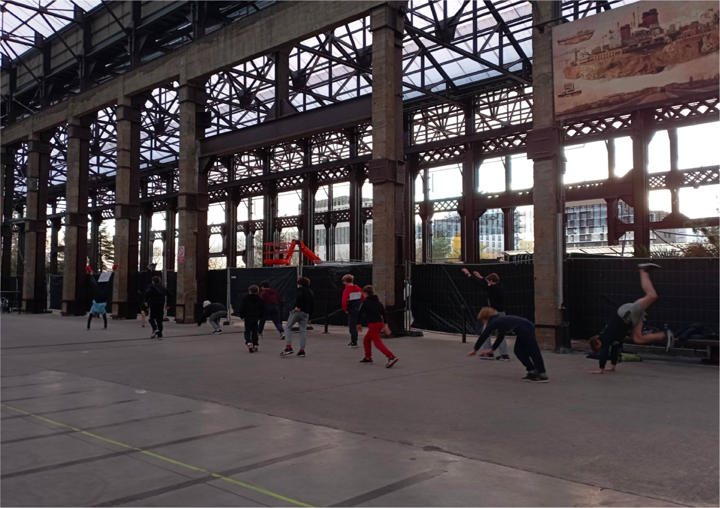
Photo taken during our meeting with a group of traceurs in Nantes.

Qualitative data

We met up with traceurs and were able to participate in a training session and interact with them, it allowed us to get spontaneous answers to our questions.

We also sent e-mails to a large number of parkour associations and had the opportunity to discuss with one of the leaders of the freestreet parkour association by phone which allowed us to understand the main characteristics of the discipline, as well as quantitative data, number of members, age, range, share of men and women of each association.

I selected questions that we asked frequently:

  • “What are the values of Parkour according to you?”
  • “Can you describe a typical training?”
  • “Why do new members start parkour?”
  • “What are the prejudices you are confronted with?”
  • “How many participants do you have in your association?”
  • “What is the proportion of men and women practicing parkour in your club?”
  • “What are the most popular places for a parkour session?”

What we learned

Our research enabled us to confirm the values that we had identified, which are the following: knowledge and surpassing oneself, solidarity, adaptability to the environment, open-mindedness, curiosity and creativity. Parkour is a practice with few constraints because parkourers have a flexible schedule and the places of expression are multiple. It is recognized as a physical activity and not as a sport in France and the authorities are rather tolerant when it comes to the public domain because of the free appropriation of urban spaces.

Understanding the club: TDN

The club's objectives

  • TDN trains all ages (11 years old to adults ) but the club would like to attract more girls and women.
  • Make clear that it is supervised by a qualified trainer / No risk.
  • Pass on Parkour's values

The competition

Traceur de Nantes has one main competitor, the only other Nantes Parkour's club which is “Art Du Déplacement Academy Nantes”: the diffrence between the two is that TDN is younger and smaller but it has a proximity with trainers compared to “Art Du Déplacement Academy Nantes” which also is more expensive.
Other competitors are skate and climbing clubs. The avantage of climbing clubs is that they are more inclusive.

Card image cap

Visual identity

With our previous research we were able to establish the challenges of the visual identity:

  • Take into account the rebellious spirit behind Parkour and inspire trust for parents.
  • Be playful, convivial and open but convey the seriousness of the structure in particular the fact that learning is done in optimal safety conditions.

We set up a plastic device with collage, paint, tape, transparency, keywords, photography (We went where the club is training to collect experimental photos of the site like graffiti, street and buldings) to explore graphical tracks. We worked with the value of the discipline in particular movement, displacement and freedom. Also, we took into account the urban, "street" roots without being limited to them. Then, we were able to make a graphical charter and a logo.

Parkour being an art of movement we took this opportunity to conceive the logo in a generative way.

Card image cap

Setting up the structure

First of all we highlighted the current websites positive and negative points, for example one of the main points was the disjointed categories leading to scattered info. After that, we made a site map. Then, we went through a few rounds of iteration using hand sketching.
We also came up with a revised and simplified information architecture that focused on presentation of the club, registration and easy management of accounts.

While working on simplifying registration we divided it into two parts. For a new trainee, firstly they have to choose training type and fill in important information, proceed to payment and then secondly they can create an account on the website.

Our solution is based on two propositions.

First, the redesign of the site in order to improve referencing, accessibility and simplicity of registration, thus gaining in efficiency for the user.

Then in a second step, the redesign of the graphic charter in order to improve visibility and dynamism which makes it possible to gain the confidence and desire of the user. As part of making the site more accessible, we allow easy and fast registration of members, with registration that takes place through an online form to fill out. Also, users will have a page where they can manage their data and ask questions.

Eye tracking

We added graphic elements in a similar style to maintain a cohesive treatment across the site's elements. We organized the page so the user could have access to all important information within the first scroll.

Call to action

We made a call to action yellow on a blue background with an dark hover which makes it stand out so that the user knows what to do and where to go next. This eliminates confusion and allows the website visitors to take the appropriate next steps to subscribe.

Hint to see more

To inform site visitors that there is more info if they click on the plus, we made a fun hint, shown here:

Subscribe journey

For the subscribed part, we wanted it to be an easy to use interface design so we anticipated the user journey. For example: we inform the user of what is absolutely necessary to complete the membership at the beginning of the form and we made the possibility for both the parent and the future traceurs to subscribe in one go. Also, we made sure to make the graphic design simple. This allowed users to easily check what they need and what they are asked, making their journey throughout subscribing trouble-free and smooth.

Final design

As designers, we pre-process the page for users, organizing and prioritizing content in a way that users can grasp almost instantly, but there are always things that we don’t anticipate and even more as a student. So, we conducted an eye tracking test to find out the pain points of our interface allowing us to afterwards improve the user experience of our website.

  • We set the user in front of our website and we followed a design interview protocol leading to the user to subscribe: check it here.
  • Then we made them fill out a satisfaction survey in order to collect their feelings about their experience: you can check it out here.
  • Finally, we met with each of them to have a discussion allowing us to gauge feelings that maybe the survey didn’t catch.
One of the 6 eye tracking videos we made.


Results

  • All users reached the registration goal, there were no dropouts.
  • Registration time: 2'00" to 4'50" with an average of about 3 min and users felt the registration was quick.
  • Almost all users agree that the website is very easy to navigate with a real clarity and good hierarchy of information.The design and visual identity of the site is the preferred aspect of 4 out of 6 users, with others being its ergonomics and its ease of navigation.

Improvements

This work highlighted important improvements to make in order to create a better user experience:

  • Possibility of going back, which wasn't present in our site, unless you click on the logo, but only takes us back to the homepage (we improved it).
  • Possibility to modify one last time the information just before making the payment.
  • Modification of the selected fields buttons.
  • Improvement of the visual for the Facebook post-sponsored, with the name of the "Traceurs of Nantes" for a more efficient visibility and a better understanding at first glance.
  • Add an icon and a messaging interface in the space my account to to chat with other parkour participants.

Biases on the test

Finally, from our point of view, the users had a too precise instruction to allow us to observe a real user experience. It would be interesting to do other tests without precise instructions.

What I would do differently

This project is one year old now and since then with my apprentiship and side courses and readings I have improve my skills in accessibility concerning colours, spacing, size as well as universal design, inclusive design, and equity-focused design. For instance, I would surely add audio description and change CTA's colours, the black on blue first. Also, I think it would have been interesting to test different user flows with users instead of one. Nevertheless I think the good points of this project are our long research on different mediums for the graphic charter and the research part on which we spent a lot of time.

Lessons to be learned

While working on this project I was really suprised by the freerunners’ willingness to help us understand their values and way of doing things. It made me want to improve my skills in UX research. Since then I have read up on the topic and work in UX research at Stellantis.

Also, during this project, at first we thought that we were going to do a website for teenagers but after our research we found that it was more the parents that we wanted to convince. So it was an intresting way to be put in front of our own biases.

Thanks

Thanks to our instructor Xavier Drouaud, to Florian Butour for helping us on the UX / UI part and to Amandine Delord for introducing us to anthropology and of course thanks to the Traceur de Nantes for allowing us participate in a training with them. Also, thanks to the person who tested our prototypes and gave us feedback!

Team

Léa Veron, Air France UX Designer
Galadriel Buchou, student
France Hémain, student